Walmart Grocery Pick Up
Designing a seamless grocery pickup experience for busy households (2016)
Context
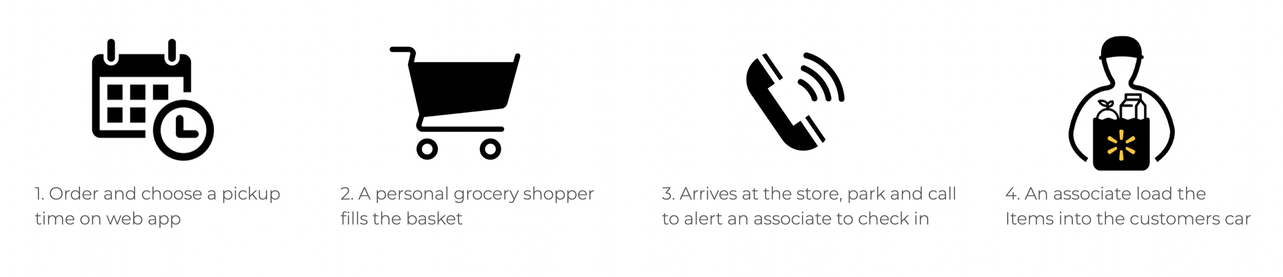
Walmart grocery pickup is a convenient way for you to get your essentials without having to spend time browsing for your items in-store or waiting in long checkout lines. The traditional way required customers to call the store before arriving at the pickup location. For customers, this check-in method was cumbersome, slow and unreliable. Only 2% of total customers used the pick-up service on a regular basis.
Problem with the prior pick up experience
“The service is slow and unreliable.” - Customers
"Our manual phone-in system is too slow to handle the high volume of new orders." - Business
Research & Insights
To identify why only 2% of customers used the existing pickup service, I conducted user interviews to uncover the emotional and physical friction points of the "manual" process.
Our primary users were busy parents (ages 30–50) who prioritized efficiency above all else. Our study revealed significant friction points:
System Reliability: Manual phone check-ins often failed, leaving users wondering if the store even knew they were there.
Time Loss: Customers chose pickup to save time but frequently waited 20+ minutes in their cars due to communication bottlenecks.
Cognitive Load: Drivers struggled to toggle between navigation apps and the Walmart app while navigating complex parking lots.
For users, the value of pickup is efficiency; however, the manual check-in system introduced a 'black box' delay that turned a time-saving service into a point of frustration.
Synthesizing the Friction
Research highlighted a disconnect: customers wanted to save time, but manual system delays stood in the way. We decided to solve this by transitioning to a digital check-in flow that anticipates a user's arrival the moment they enter the parking lot.
Direction
Goal: Expedite the pickup process by digitalizing the check-in flow
Hypothesis: If we offer a fast and easy way to check in, more customers will shop at Walmart since they can avoid hassle and save time.
Audience:
Walmart Grocery customers
Success Metrics: Total number of orders completed, Average wait time at pickup
Design Explorations
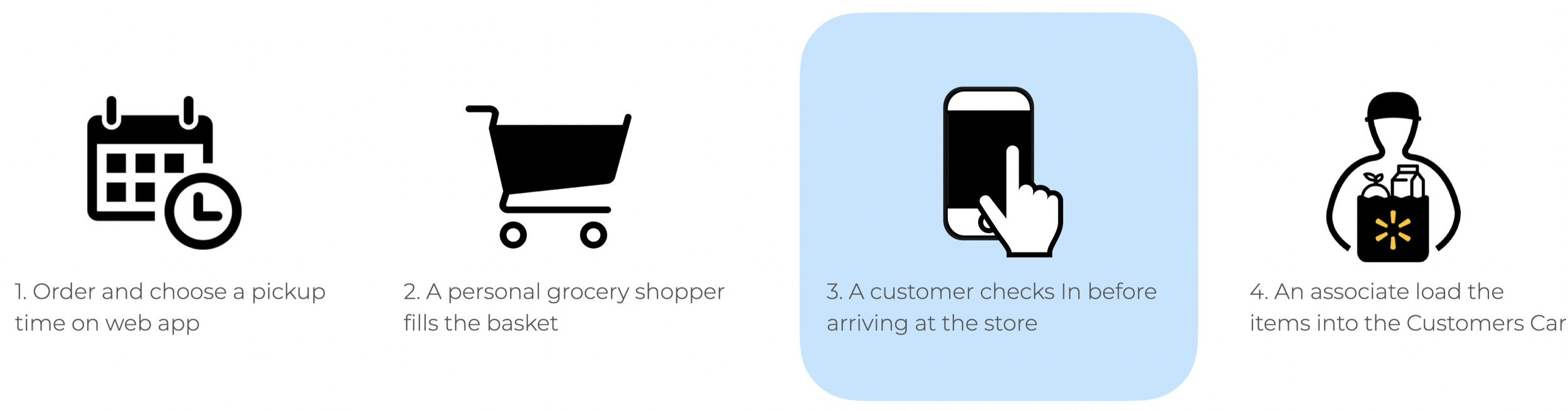
Digitalizing the Check-in
I partnered with Product and Engineering to map the 'Order-to-Trunk' journey. Together, we defined a digital flow built on three pillars: Feasibility (technical stack alignment), Visibility (associate awareness), and Speed.
Defining the Entry Point
To determine how a user should trigger a "Check-in," I analyzed high-frequency location apps like Google Maps and Uber. I explored three distinct concepts for the arrival trigger:
The Homepage Banner: A persistent, high-visibility "Check-in" button that appears only during the pickup window. This ensures the entry point is always one tap away without digging through order history.
Smart Push Notifications: Leveraging time-based triggers to prompt the user to check in exactly when they are likely to be starting their drive.
SMS Integration: Since many users have low app engagement, SMS provides a universal, "no-app-needed" way to receive real-time updates and check-in links.
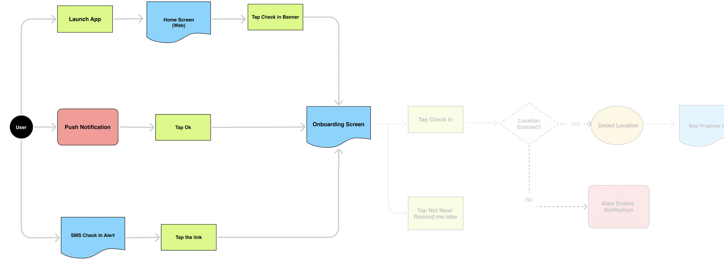
To ensure a seamless hand-off, I also defined a two-way information exchange that reduced cognitive load for the customer and operational friction for the associate:
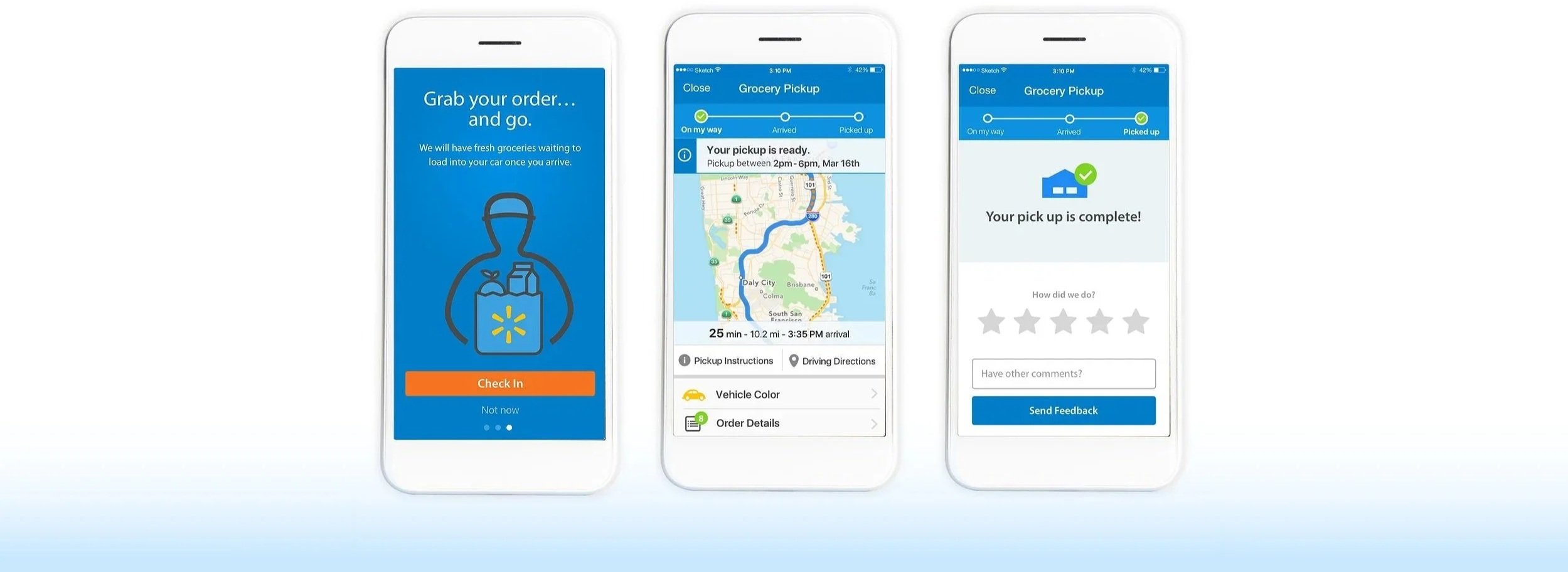
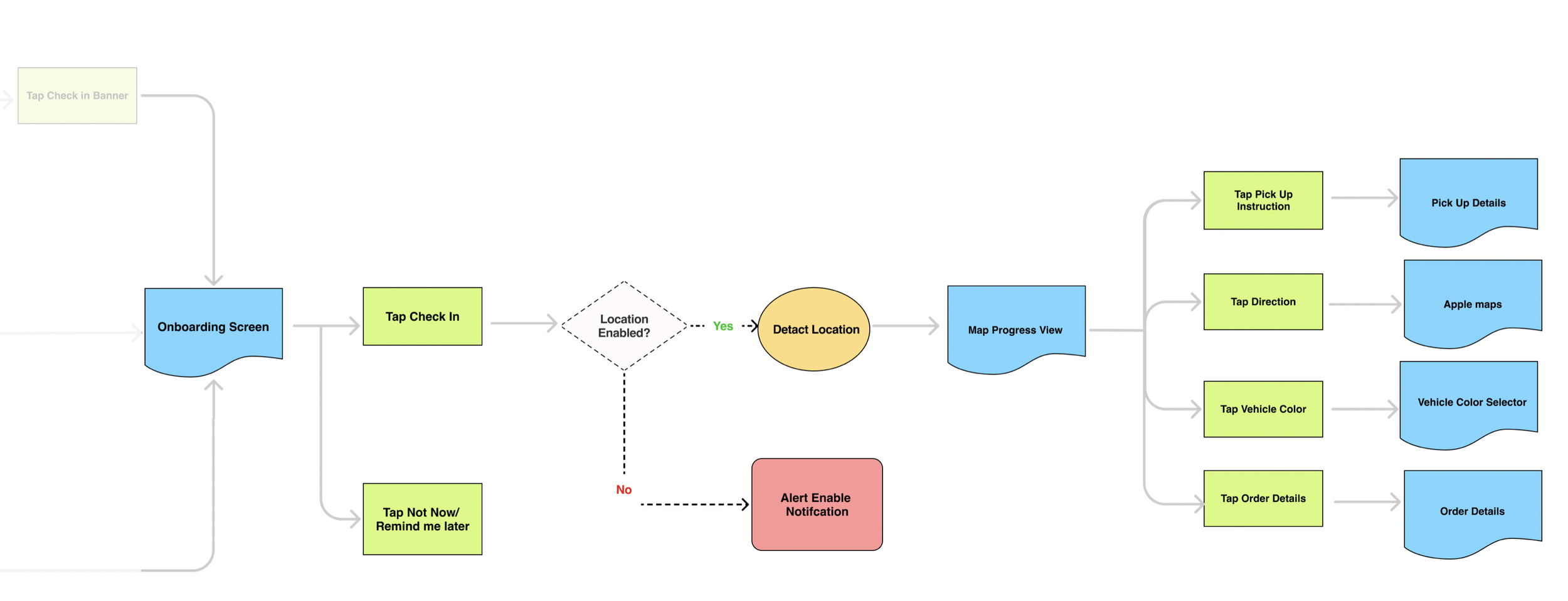
For the Customer: I integrated a Map View directly into the UI. Research showed users hated toggling between GPS and the Walmart app, so providing directions and order details in one place kept them focused and safe.
For the Associate: The system automatically transmitted the customer’s ETA and account info upon location consent. This removed the need for manual check-ins and allowed associates to prep orders for the exact moment of arrival.
Decision & Strategy
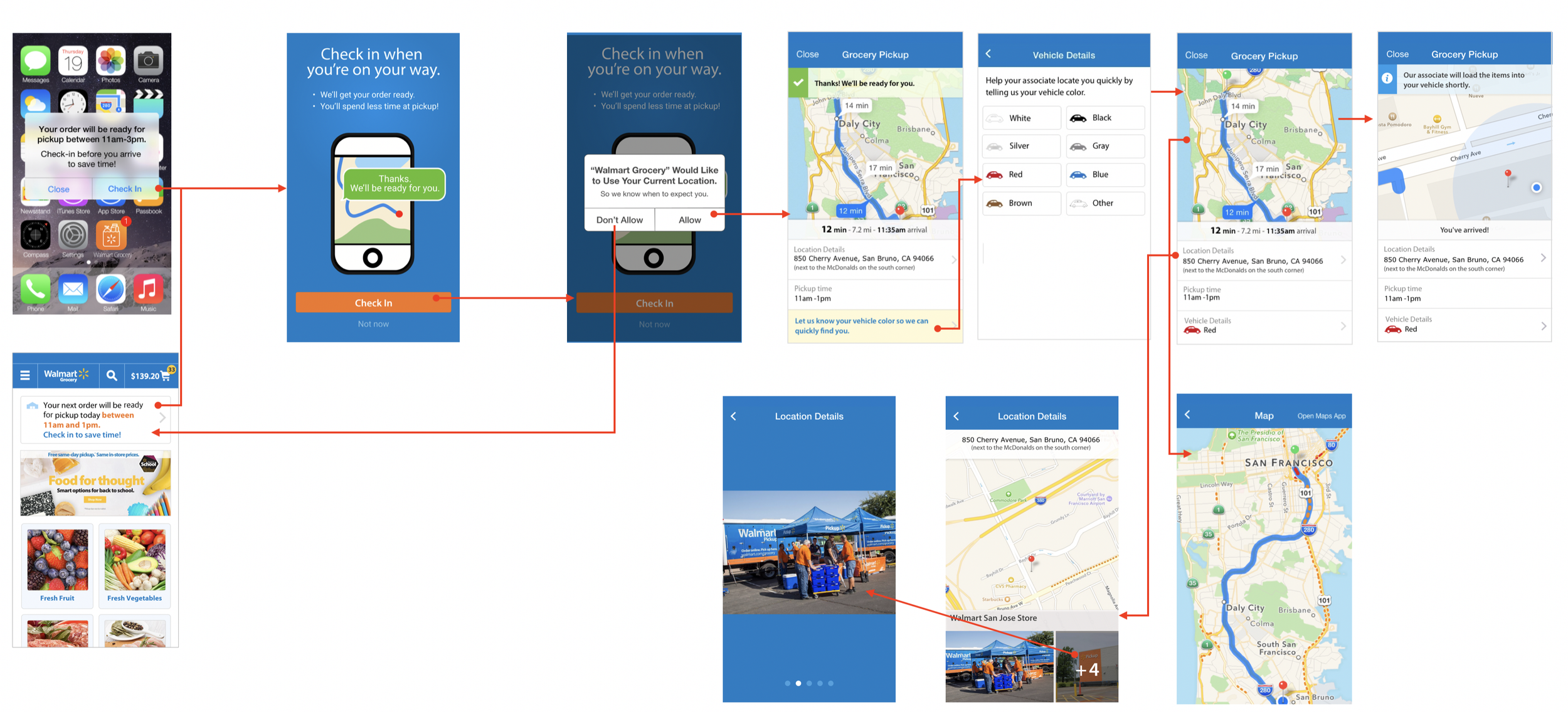
We moved forward with the Homepage Banner and Push Notifications as entry points. While we considered SMS, we prioritized in-app triggers to ensure a more secure, data-rich connection between the customer's location and the store associates.
To help associates work faster, I introduced a "Vehicle Info" prompt. By asking for vehicle color rather than complex plate numbers, we followed real-world conventions that allowed associates to identify cars at a glance even in parking lots with limited signage.
User Journey: The Texas "Smoke Test"
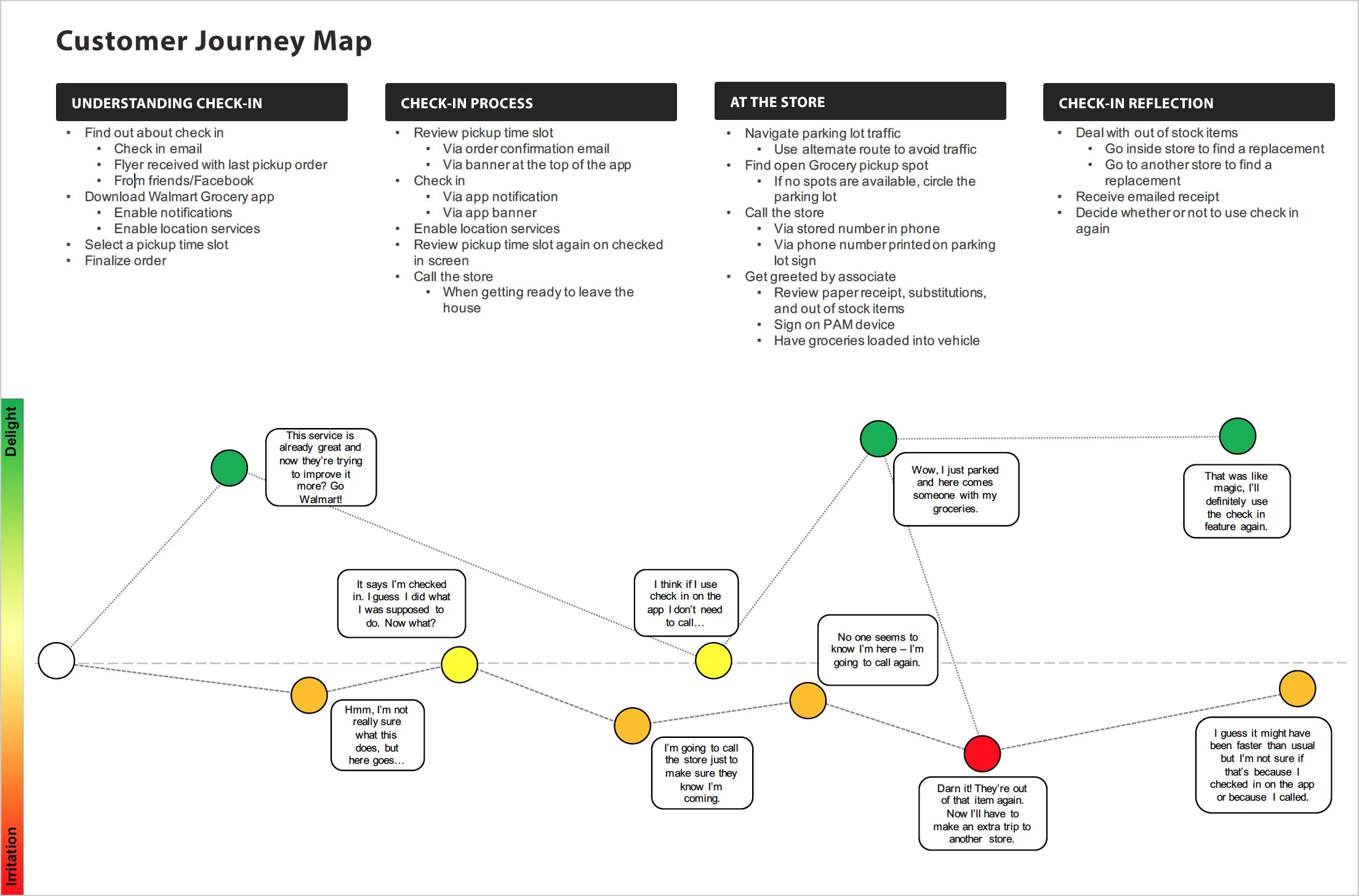
To validate the initial digital flow, I joined the research team in Texas for a week-long field study. We followed ten customers through their end-to-end shopping journeys to observe how the new system performed in a high-volume, real-world environment.
The Findings:
80% Success Rate: Most users found the digital flow significantly more efficient.
The Learning Curve: A small segment still attempted to call the store out of habit, signaling a need for stronger onboarding and real-time feedback to confirm their check-in was successful.
Field Learnings & Iteration
The Texas "Smoke Test" revealed critical edge cases that the initial prototype didn't account for. I iterated on the design to move from a "happy path" to a truly inclusive experience.
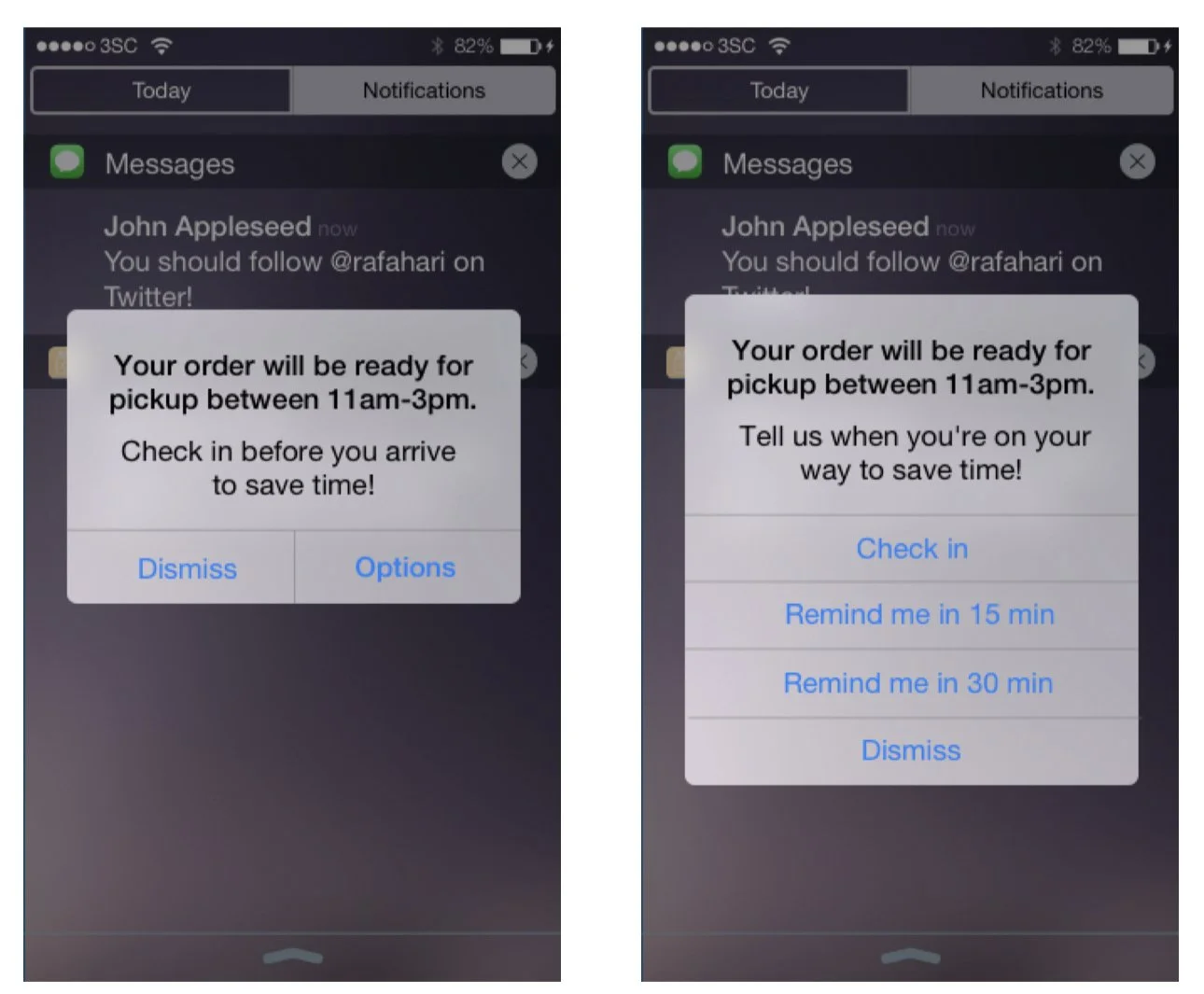
1. Designing for Flexibility
Observation: Some users weren't ready to "Check-in" immediately upon receiving a notification (e.g., they were still finishing a task at home).
Solution: I added "Remind me in 15/30 mins" options to the arrival notification, ensuring users didn't forget to check in without feeling pressured by the technology.
2. Inclusive Transportation
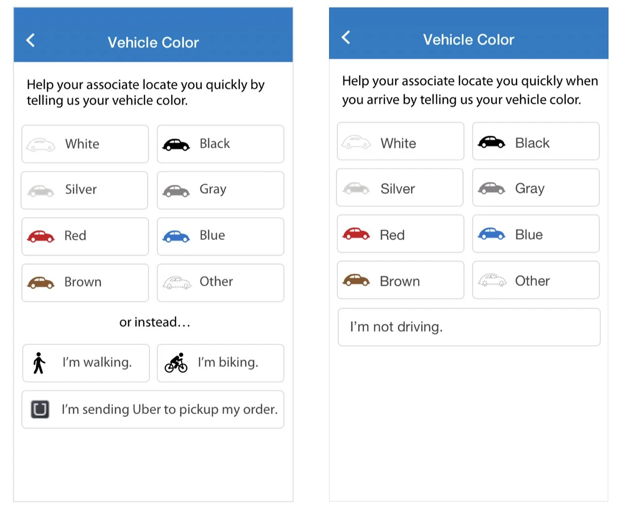
Observation: I realized my initial solution assumed every customer owned a car. In reality, some customers walked or biked to the pickup point.
Solution: I introduced Transportation Modes (Car, Bike, Walk) into the flow. This allowed the app to stay useful for all demographics while helping associates know whether to look for a vehicle or a person.
3. Bridging the Technical Gap
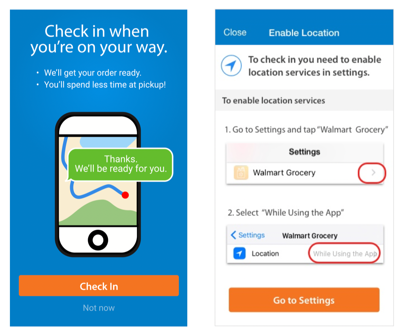
Observation: Non-tech-savvy users (specifically older adults) struggled when they accidentally declined location permissions.
Solution: Instead of a generic system error, I designed a Guided Permission Screen that used simple, non-technical language to explain why location was needed and how to enable it in settings.
4. Humanizing the Experience
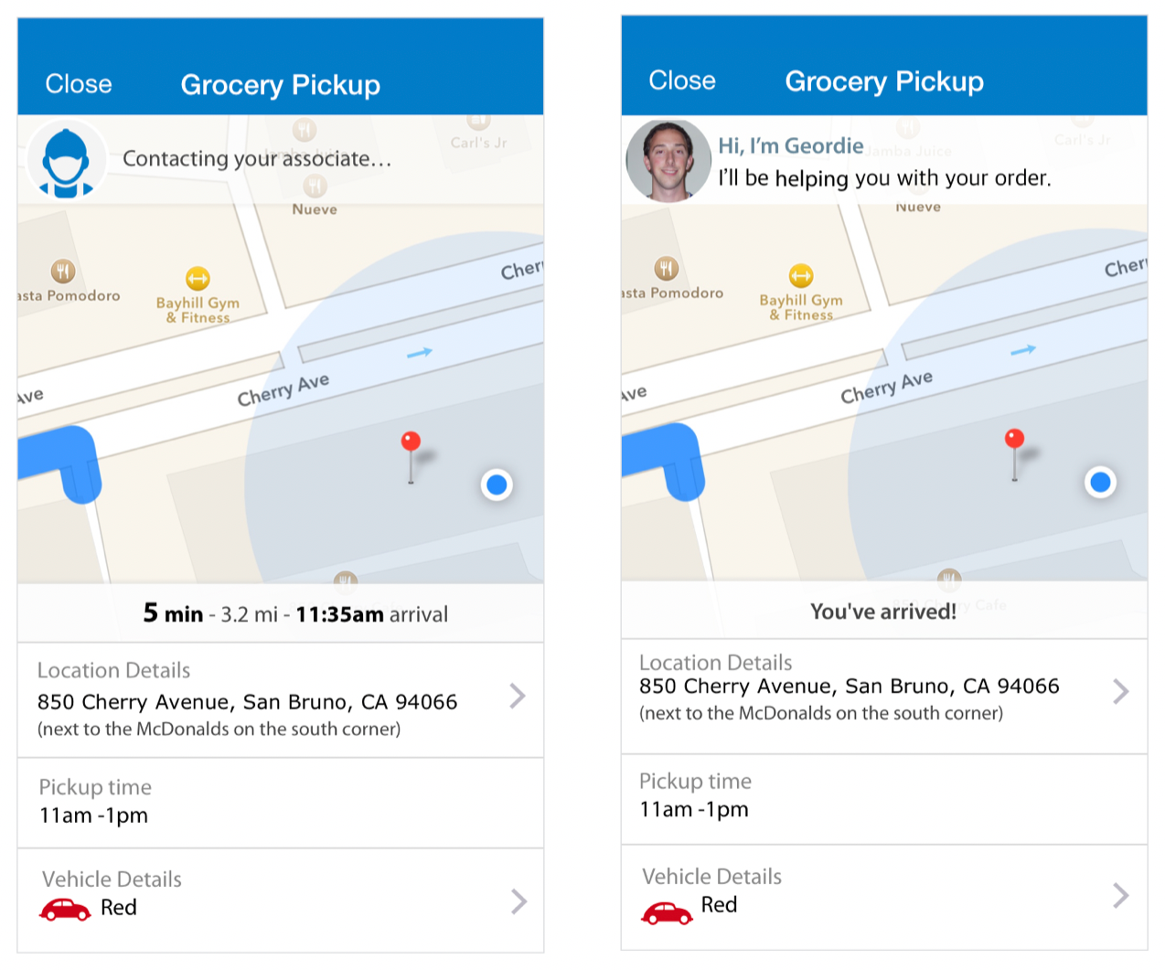
Observation: Some customers felt uneasy about sharing their live location with a "corporate app."
Solution: To build trust, I proposed showing the Associate’s Name and Photo. This transformed a data-sharing transaction into a human connection, making customers feel more comfortable opening their trunks for a specific person.
Final Design Direction
The final solution was refined to balance Walmart’s "Bold & Classic" brand identity with a modern, utility-driven interface.
Proactive Information Capture: To eliminate parking lot confusion, the "Vehicle Info" prompt was moved to the start of the flow, ensuring associates can identify the customer the moment they pull in.
Real-time Progress Indicator: A live status bar was added to the home screen, removing the "Black Box" anxiety by showing customers exactly when their order is being processed and brought out.
Centralized Instructions: All pickup details were moved from transactional emails directly into the app UI, eliminating the need for customers to dig through their inbox while driving.
Integrated Feedback Loop: A post-pickup rating system was implemented to provide the business with real-time sentiment data and allow customers to feel heard instantly.

Onboarding
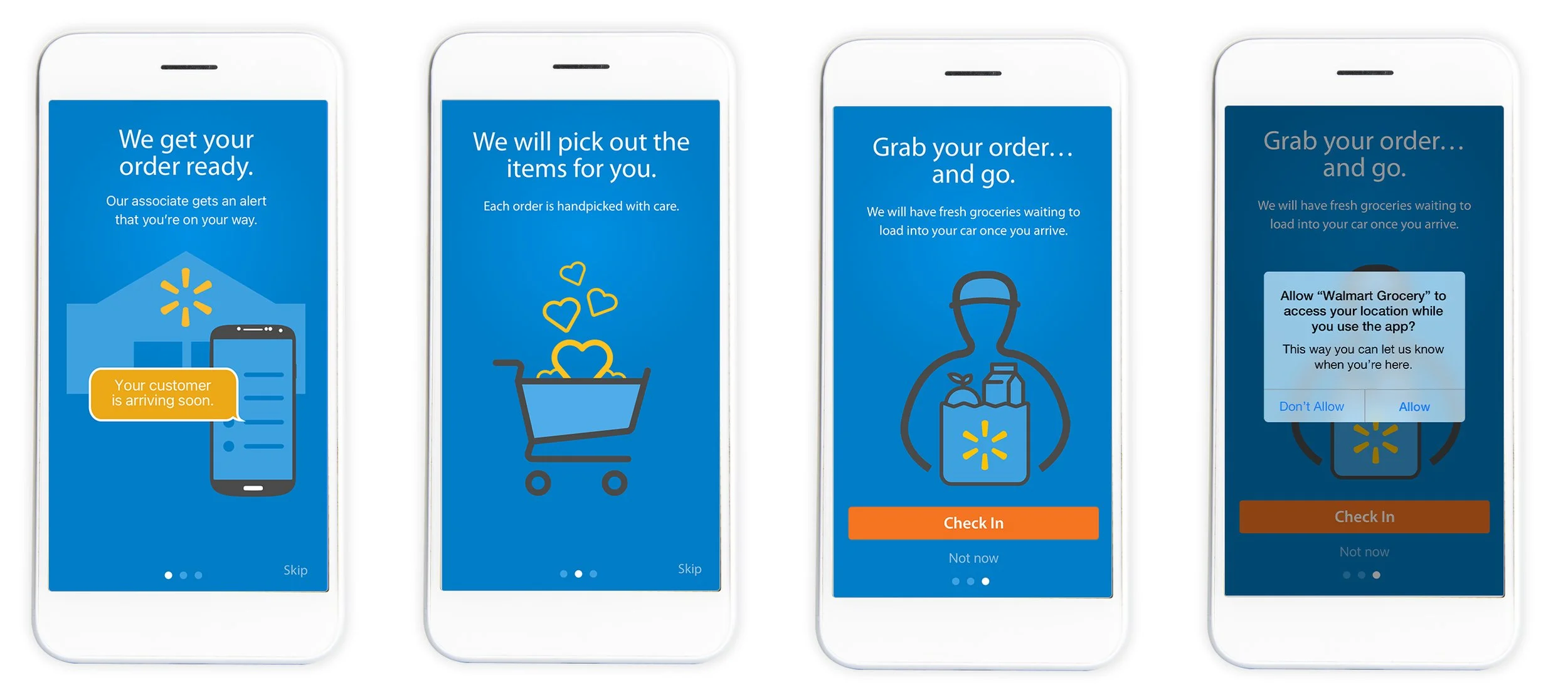
The Texas "Smoke Test" revealed a habit-based hurdle: because digital check-in was a new concept in 2016, users instinctively reached for their phones to call the store. To bridge this gap, I designed a contextual onboarding flow.
Behavioral Shift: Replaced technical jargon with a 3-step primer to explain the "How" and “Why” of digital arrival.
Confidence Building: Used simple language to reassure users that an associate is actively tracking their progress.
Reduced Anxiety: Proactively addressed location-sharing concerns to build trust before the user reached the parking lot.
Impact & Results
To validate the redesign, we launched a pilot program across select Texas locations, testing the digital flow with 1% of the customer base. The results confirmed that removing manual friction directly correlates to customer retention and speed.
40% Reduction in Wait Time: Average pickup time dropped from 12 minutes to 7–8 minutes, significantly exceeding our initial goals.
5% Increase in Order Volume: The streamlined experience led to a measurable lift in total completed pickup orders.
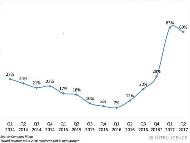
Sustained Growth: Since the 2016 launch, the grocery app has been a primary driver of continuous online revenue growth.
Scalability: The solution successfully scaled over 2,000 stores across the U.S., proving that a digital-first arrival strategy is the gold standard for high-volume retail.