
Robinhood Asset Discovery
Improving asset discovery through guided search and exploration (2023)
Context
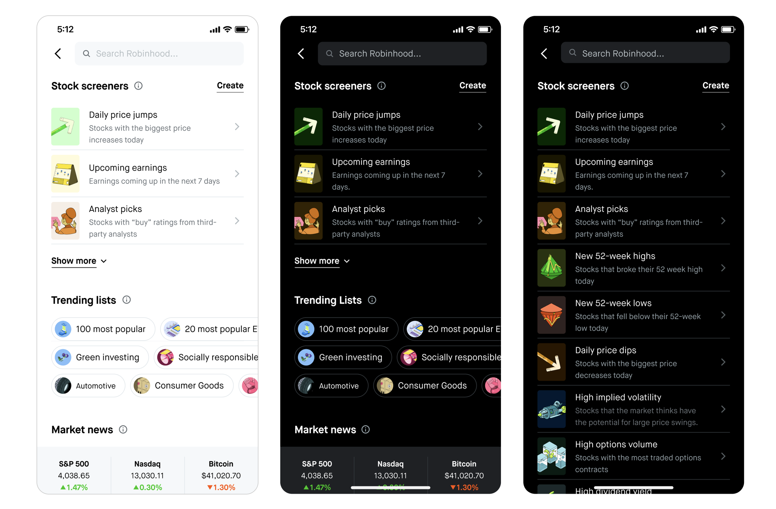
Our research showed that users come to the Search page looking for inspiration, yet the existing experience lacked the guidance to help them start. This 'blank slate' problem resulted in low engagement with our diverse assets and products. My goal was to redesign the landing page to bridge this gap, transforming passive searching into a proactive, discovery-driven experience.
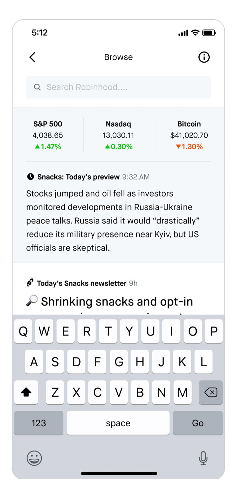
Previous design
Problems
"I want to narrow down my investment options while searching, but there is no easy way to do so on the Robinhood app." — Advanced users
"I want to invest but have no idea what to look for.” — Non-advanced users
Data insights
I looked at the quant data, and observed that a large majority (92%) of all search clicks were associated with stocks, etfs, and crypto, which means that users currently come to the search page largely for asset discovery.
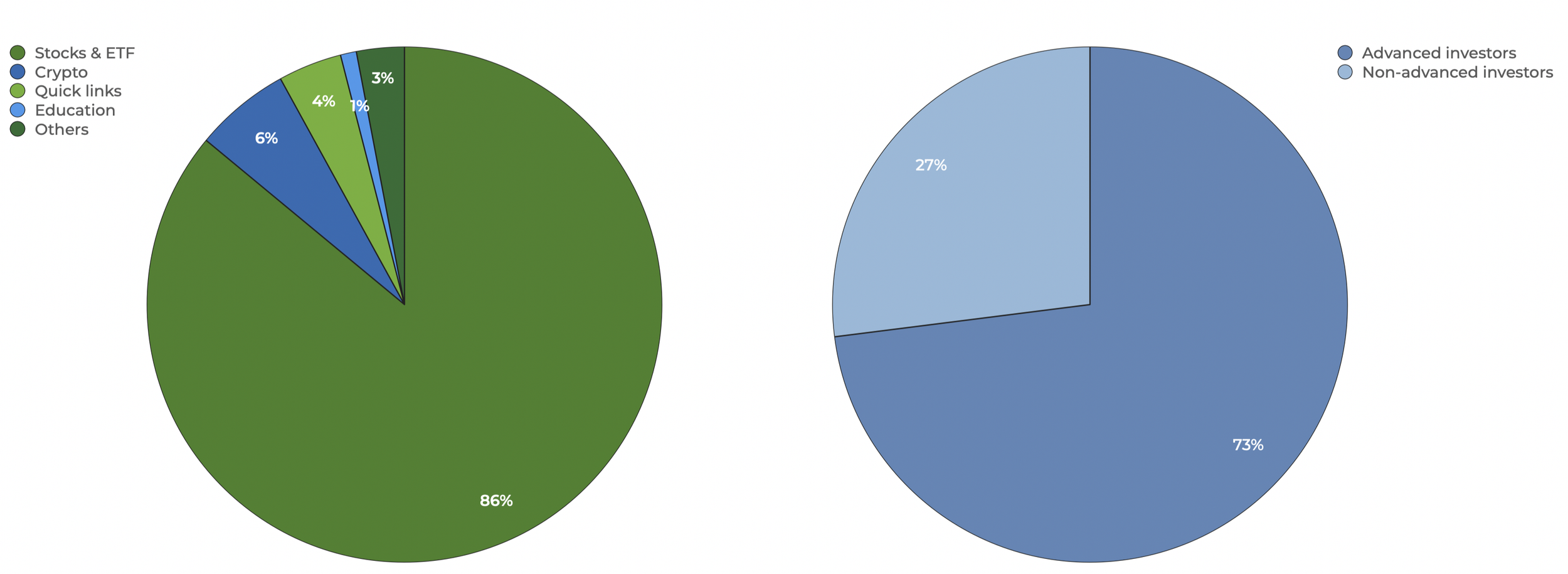
Also, based on recent data, 73 % of WAU who click into search are Advanced investors (investors who have more than $100 on their account and trade on a regular basis)
Key learning from research
1. Users’ primary goal for visiting search page is asset discovery.
2. 73% of users who utilize search on a weekly basis are advanced investors.
3. Users want guidance around asset discovery rather than being bombarded with excessive irrelevant market & news info.
4. Users often conduct their own research outside of Robinhood because there are no tools to support analysis-based search needs.
Search is mainly used by advanced investors to find assets, but it doesn’t provide enough guidance or tools to support their research.
Direction
Goal: Providing tools for asset discovery and strategy building.
Hypothesis: Providing tools that are related to asset discovery and strategy building will lead to incremental revenue from incremental trading activity.
Audience:
Primary: Advanced users
Secondary: Non-advanced users
Success Metrics:
Short-term: More awareness and engagement with the discovery tools
Long-term: Increase trading metrics / D-30 funding rate
Concept Explorations & User testing
I considered several ways to improve the current search landing page to support customers' primary JTBD: Asset discovery. With the concept designs, I conducted a concept testing session with 7 real users to quickly gather feedback on the various design concepts.
Concept 1: More visual guidance & focus on the curated list based on common heuristics
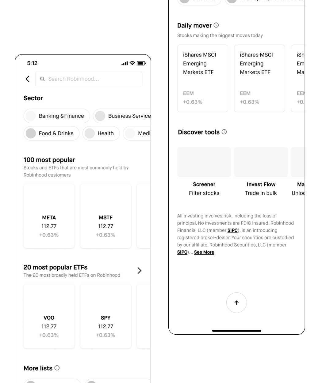
I leaned into visual guidance and curated lists built around common discovery heuristics—things like brand recognition, popularity, and sector. These are cues users already rely on when evaluating assets, and I saw similar patterns across other financial apps, so it felt like a familiar and intuitive approach.
"When it comes to making investment decisions, I prefer facts and data over trends."
— Advanced user
Concept 2: Less visual guidance & user control over the lists
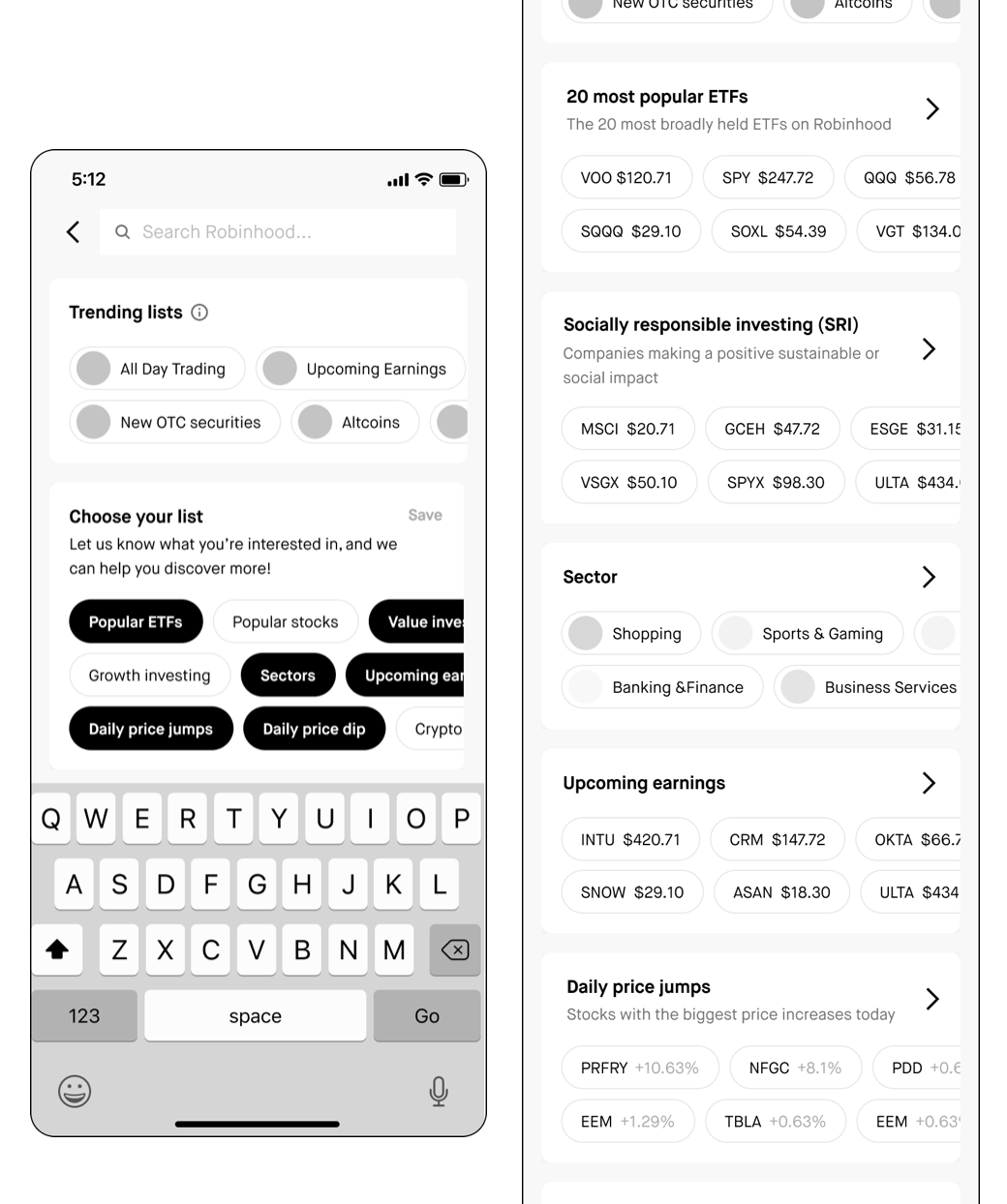
I included a small Trending Assets section to give users a quick entry point into discovery. I also introduced a “Choose Your List” section, where users can select topics they’re interested in and the system automatically populates each list with relevant assets.
"It looks incomplete, and I don’t understand certain topics”
— Non-advanced user
Concept 3: Less visual guidance, more focus on search functionality/ tooling
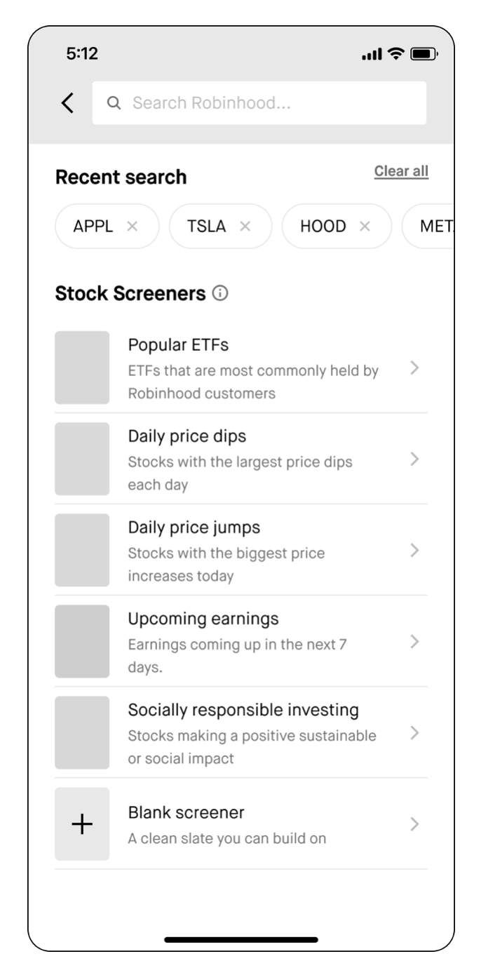
I suggested introducing the Stock screener , which was a stock filtering tool, something we had on the other tab, but the entry point was very hidden, so the engagement was really low. I thought this would be a perfect tool to surface on the search landing page as users wanted to narrow down their investing choices as well as research the actual numbers & data.
Also surfaced the Presets - lists of assets that have popular filters applied to them already - previously the presets were varied in the creation flow - but I suggested to display them on default with clear visual entry points for easy access.
"I like the preset list with additional descriptions for each item, it's easy to read and understand."
— Non-advanced user
"It's fantastic to be able to make your own list, and the tool is useful!”
— Advanced user
Concept 3 was the clear winner because it didn't force a trade-off. It gave advanced users the 'Screener' tool they were looking for elsewhere, while the 'Presets' acted as a guide for everyone else. 7 out of 7 users felt this was the most useful balance of data and simplicity.
Decision Driver
Final design direction
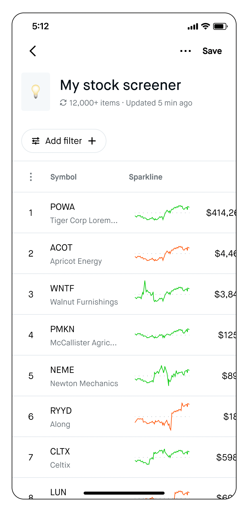
1. Tools first (Screener & Trending lists)
I pivoted the strategy to a 'Tools-First' approach, prioritizing the Stock Screener and Trending Lists. The Screener, which was previously buried in a sub-menu, was surfaced as a primary entry point to help users move from curiosity to data-backed conviction. By pairing this with Trending Lists, we provided a clear 'starting line' for those who didn't yet have a specific ticker in mind.
2. Information Density & XFN Collaboration
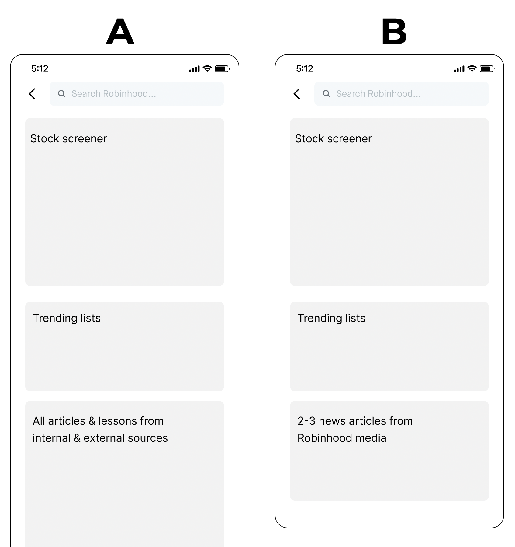
One of the biggest challenges was managing information density. While my initial research suggested a 'clean' tool-only interface, internal stakeholders from the News team were concerned about losing editorial visibility. To move forward, I negotiated a middle-ground A/B test:
Version A: The original data-heavy feed.
Version B: A streamlined layout with a 'News Snack' (2–3 high-relevance articles).
The Result: Version B saw significantly higher engagement with our discovery tools, proving that reducing cognitive load actually empowered users to explore more deeply.
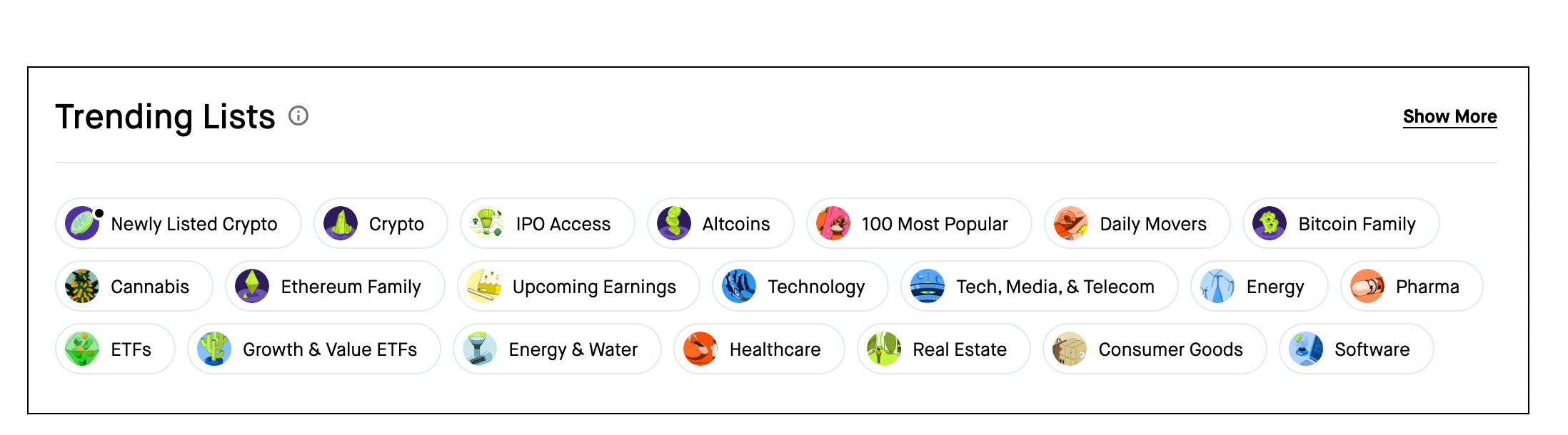
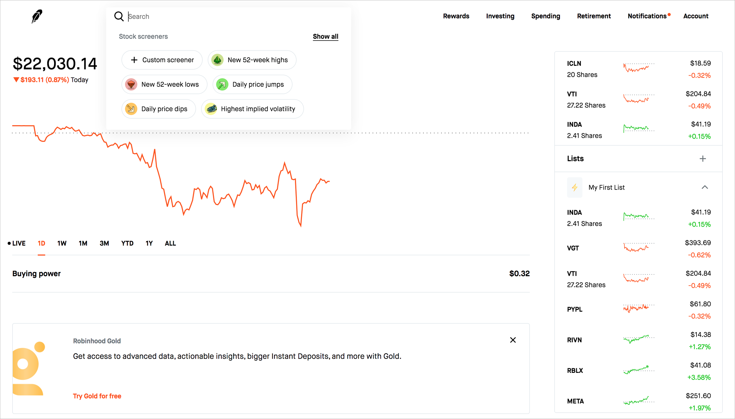
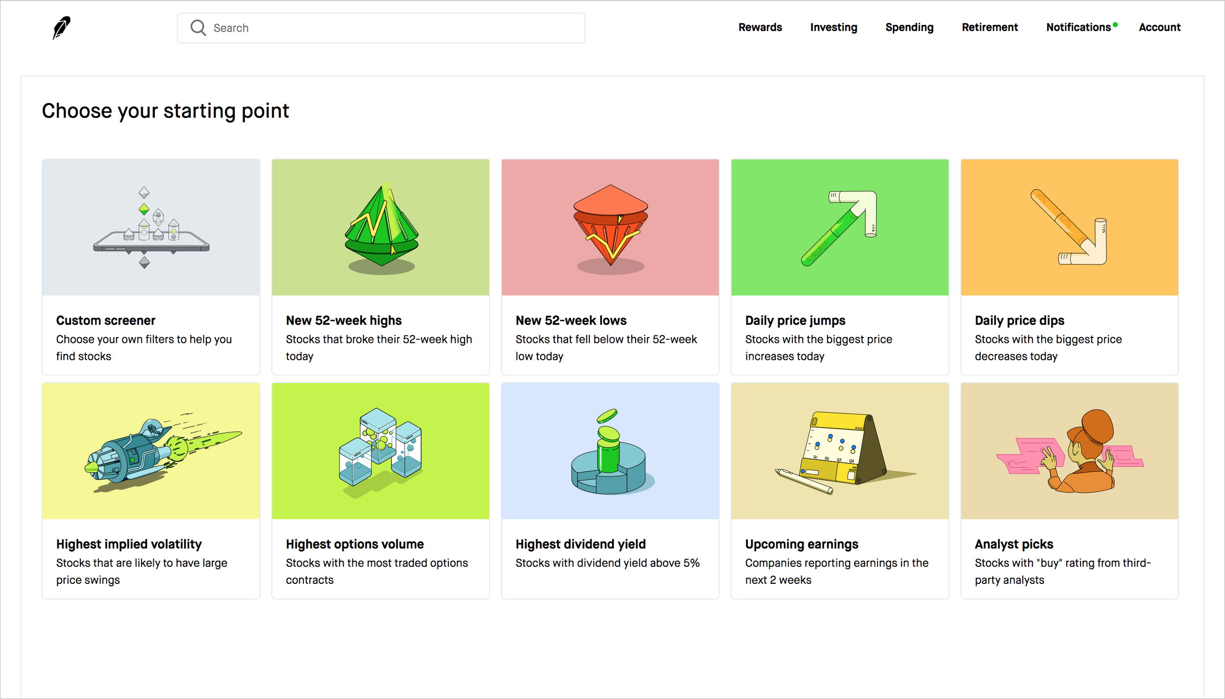
Translating this to Web required a different spatial strategy. Since we couldn't introduce a dedicated landing page without disrupting the desktop architecture, I integrated the discovery tools directly into the Search Dropdown.
Due to engineering constraints, we focused on the Stock Screener as our high-impact MVP. I opted for a 'pill' layout for the presets since it kept the UI compact and scannable while maintaining visual consistency with our existing design system.
Web exploration
Impact & Results
The redesign successfully transformed Search into a growth engine. By lowering the barrier to discovery, we didn't just increase clicks—we drove intent. The most rewarding takeaway was the 3% lift in trading orders, proving that better research tools directly correlate to user confidence and platform growth.
↑ 35% increase in engagement w/ the page
↑ 52% increase in screener engagement
↑ 20% increase in trending list engagement
↑ 3% increase in trading orders