
Facebook Suggested Prompt
Encouraging meaningful group interactions through prompts (2021)
Context
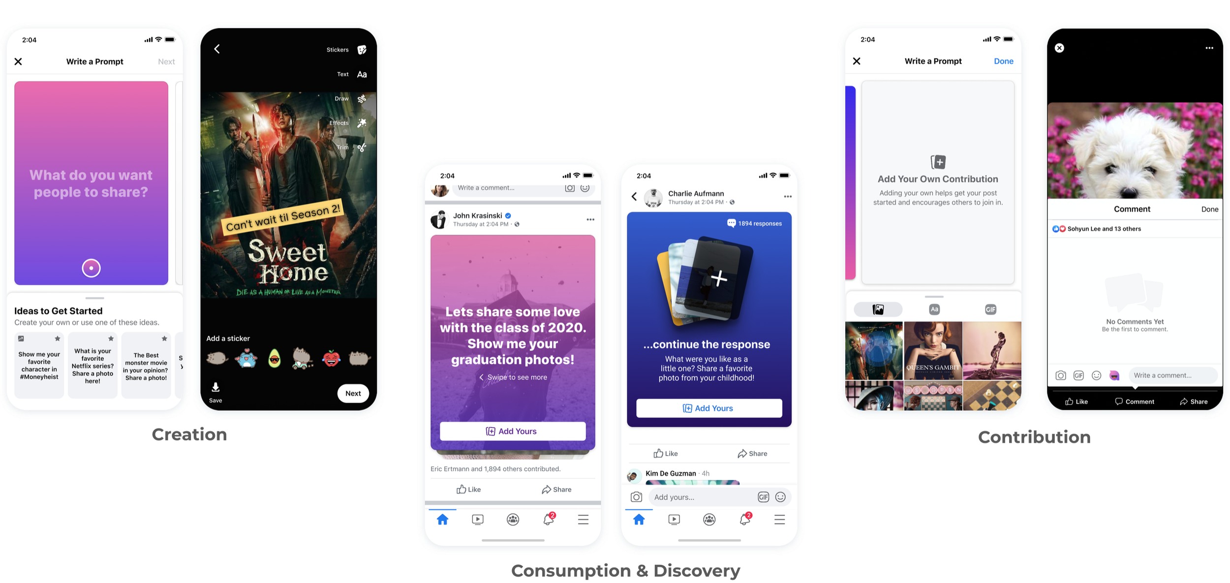
Prompts were introduced as a new collaborative post format for Facebook Groups, designed to spark engagement through shared themes and questions. However, after the initial launch, adoption rates remained lower than expected. My team and I were tasked with identifying the friction points in the creation flow and redesigning the experience to make participation feel effortless for both admins and members.
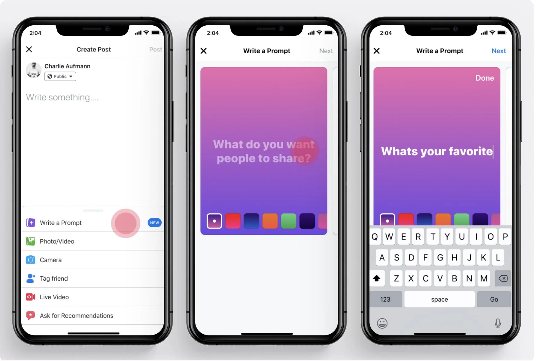
Previous design
Problems
For admins & creators, they appreciated the fact that they could easily create a visually appealing post without much effort. However, they were having a hard time coming up with a good prompt when they entered the creation flow.
“I want to create interesting content, but it's hard to think of good ideas.” — Admins & Creators
“We want to improve the adoption rate.” — Business
Research
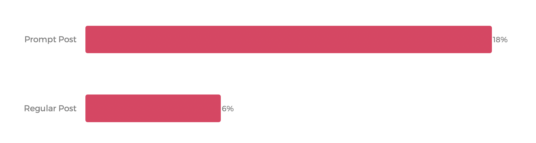
To understand the low adoption rates, I looked at our funnel data. The disparity was clear: prompt posts were being deleted at 3x the rate of standard group posts.
The timing of these deletions was the "smoking gun", 63% happened the moment the creation screen opened. This suggested a cognitive hurdle rather than a technical one.
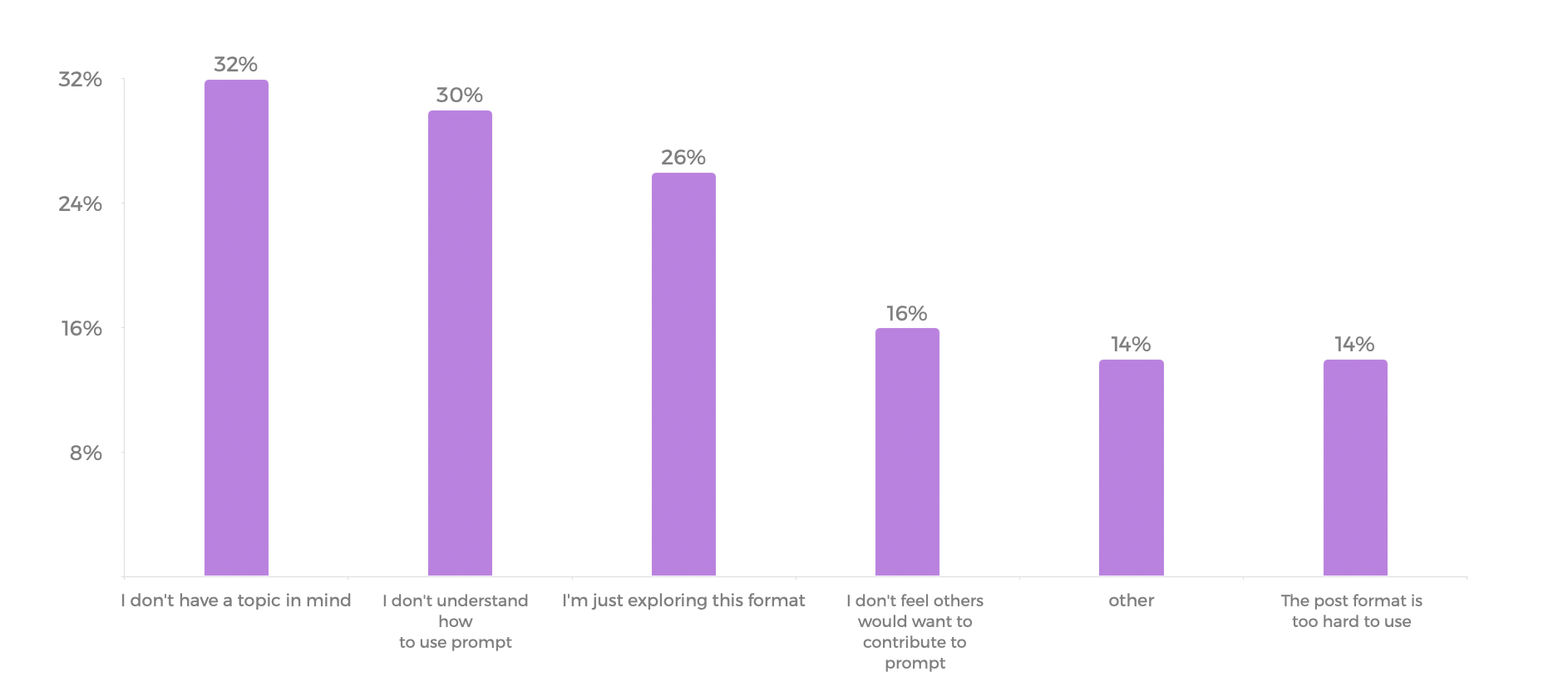
Through qualitative user interviews, I discovered the primary barrier to entry: creators often abandoned the flow because they didn’t have a specific topic in mind. This 'blank canvas' effect left them unsure of where to start, which led me to investigate their underlying motivations for posting.
Creator's Motivation
Keep their group active and engaged.
Share something they enjoy that they know other members would enjoy too.
Get to know other members better.
Key Learnings From the Research
There is a high churn rate during the creation flow due to lack of ideas.
People usually look at other FB groups or other platforms to look for inspiration when creating a post.
People felt more comfortable and confident about posting non-original content that has been successful elsewhere.
Direction
Goal: Provide sample topics to help users create a prompt easily.
Hypothesis: By providing good topics to select from, we will see an increase in the number of creations and contributions because users will have an easier time creating prompts and the topics will encourage people to participate.
Audience:
Admins & Creators
Success Metrics: Number of creations, average number of contributions per prompt.
Design Explorations
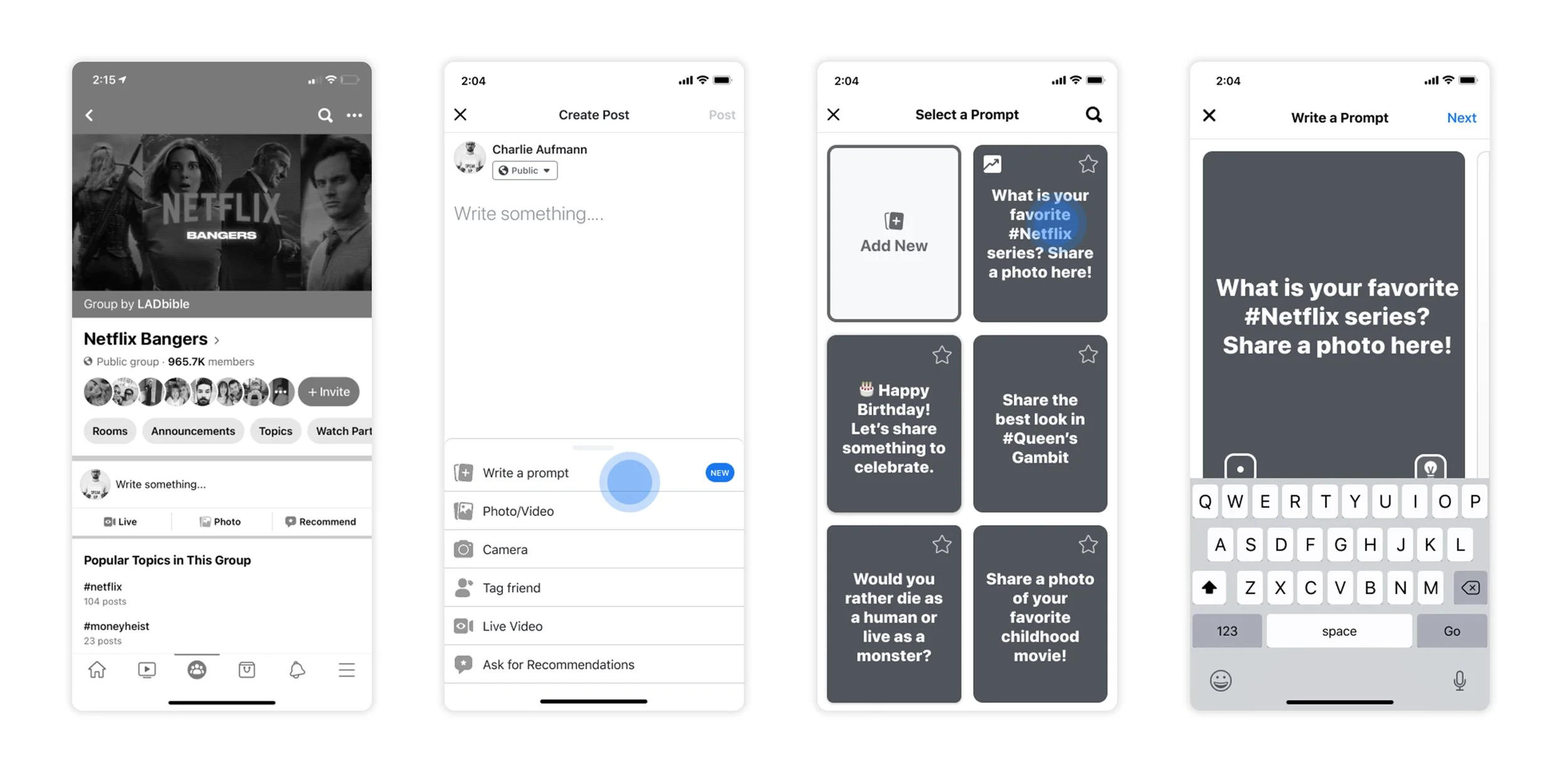
Option 1. Contextual Group Topics
By surfacing popular keywords and trending hashtags specific to the group’s niche, I aimed to inspire creators with topics they already know their audience cares about. This approach transformed the prompt from a creative hurdle into a data-driven opportunity, making the initiation feel like a natural extension of the group's ongoing conversation.
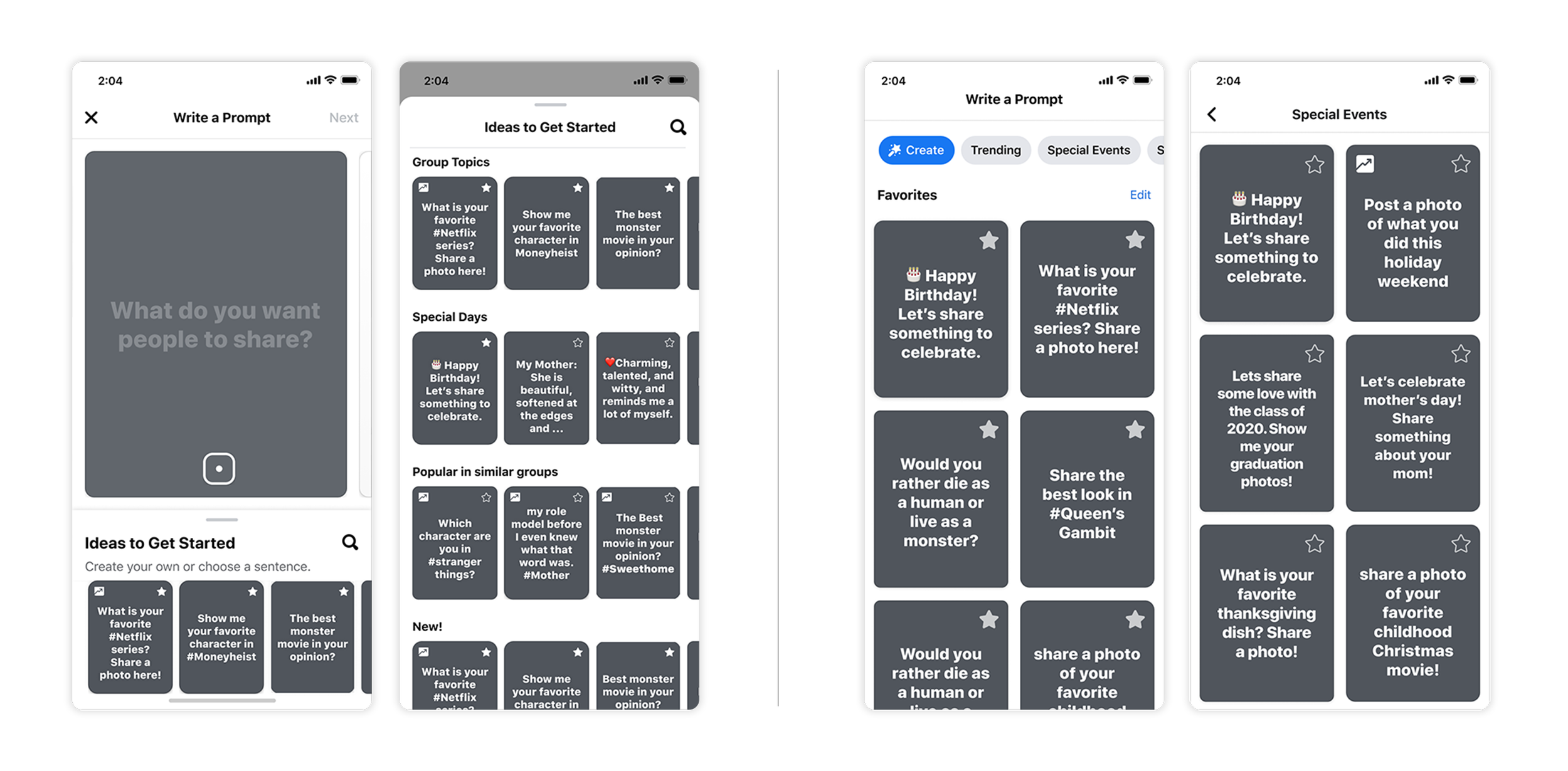
Option 2. Curated Prompt Templates
I provided a diverse library of high-quality, pre-structured 'starter kits.' My team and I identified several high-intent use cases, such as life events, recurring 'get-to-know-you' questions, and trending viral challenges. By offering visually rich templates optimized for these scenarios, we lowered the cognitive load for creators. This provided a professional starting point that they could either use instantly or lightly customize, ensuring the output was always high-quality and engaging.
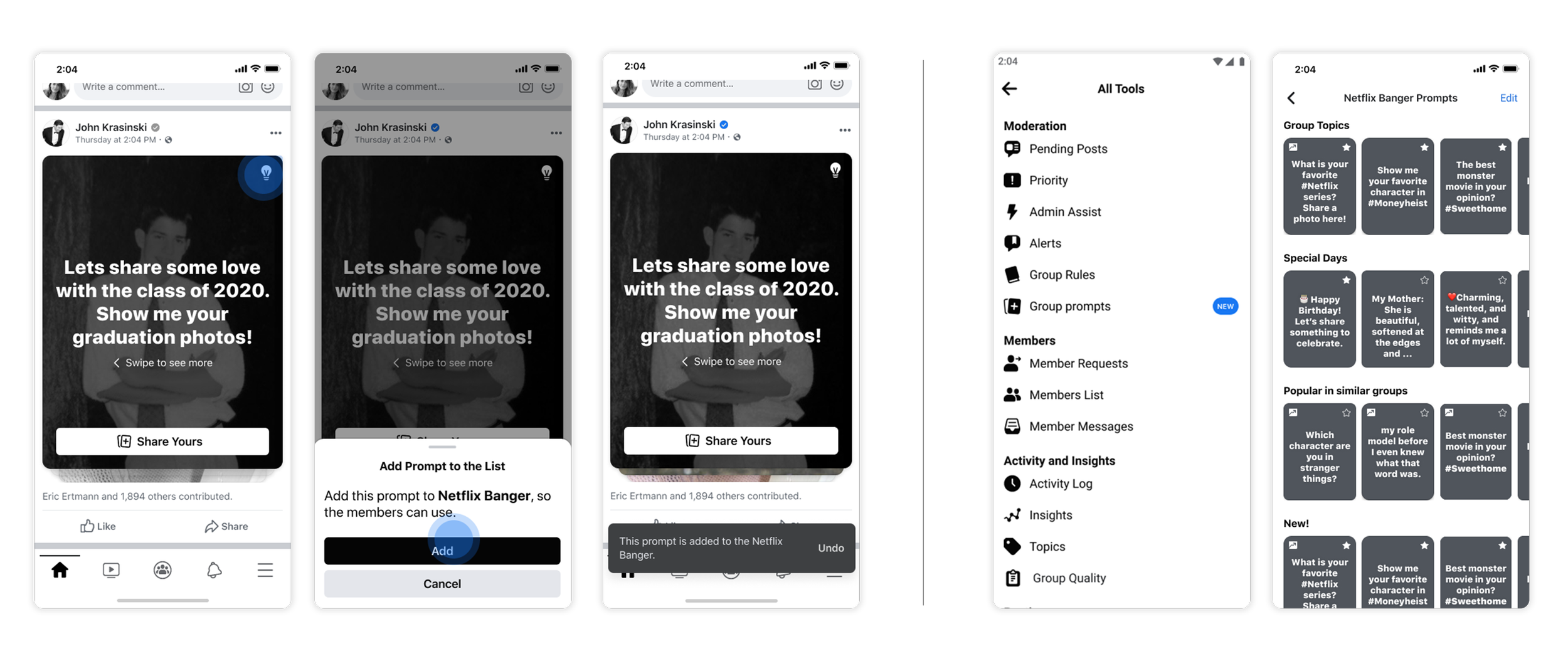
Option 3. Admin-Led Engagement Cycles
Empowering community leaders to set the rhythm of interaction. Research showed that members are significantly more likely to engage when a post is initiated by an admin they trust. This exploration focused on "Recurring Prompts" (e.g., WIP Wednesday or Monthly Fitness Goals). By giving admins the tools to automate or easily curate these collaborative rituals, we built sustainable engagement habits that strengthen the community's bond over time.
Decision Driver
I suggested Option 2 because it had the highest potential to help creators immediately. While Option 1 used keywords, it didn't provide enough variety to truly spark new ideas. Option 3 was a great long-term strategy for community building, but it didn't solve the immediate "I don’t know what to post" problem.
Visual Exploration
I focused on making the interface feel lighter and more intuitive. Here are the key changes:
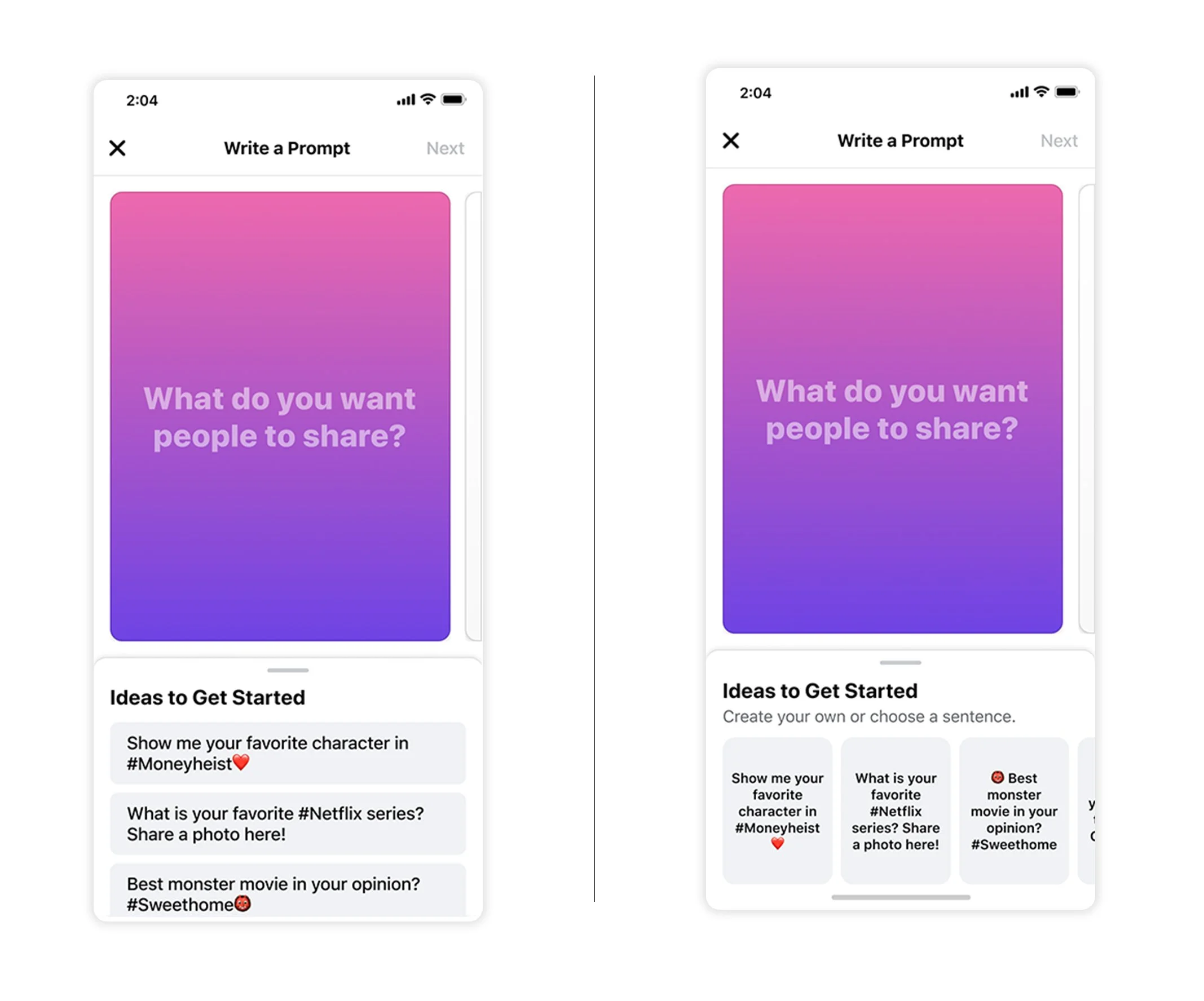
Decluttered the Screen: I minimized the background color picker. This keeps the focus entirely on the prompt ideas, which is the most important part of the experience.
Flexible Interaction: The "Ideas" panel can be swiped down to give the creator more room, but it stays visible at the bottom. This ensures they can always grab a new idea if they change their mind.
Better Tap Targets: I replaced the old rectangular color pickers with larger circles. Circles make the design feel softer and more modern. More importantly, they are easier to tap, meeting standard accessibility sizes (44x44 pixels).
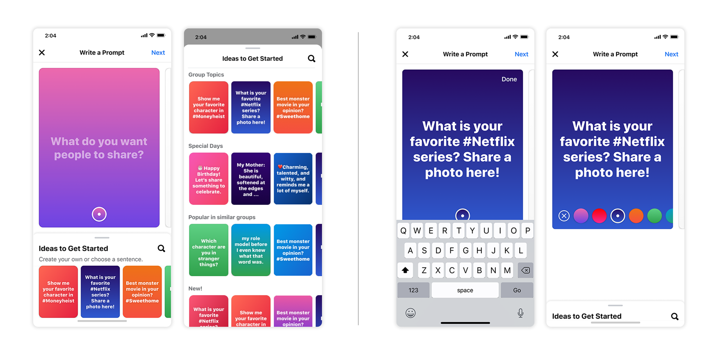
Fixed Visual Hierarchy: The WIP design had very bright cards that made the text hard to read. I updated these to more muted tones as below. This solved the readability issues and helped the creator's actual content stand out more clearly.
Content Consideration
I worked closely with our content strategist to design the actual text for the prompts. We needed to find a balance: the sentences had to be inspiring enough to spark a post, but simple enough to be translated into many different languages.
The Creative Debate: Personality vs. Simplicity We discussed whether the prompts should be short and direct or have a more conversational personality. For example:
Simple: "Show me photos of your pets."
Conversational: "Show me the cutest photo of your pet (or pets!)"
The Decision I personally felt the longer, conversational version felt more human and engaging. However, after considering the technical side, our team chose the shorter, simpler versions. This ensured that the prompts remained clear and grammatically correct when translated for our global users.
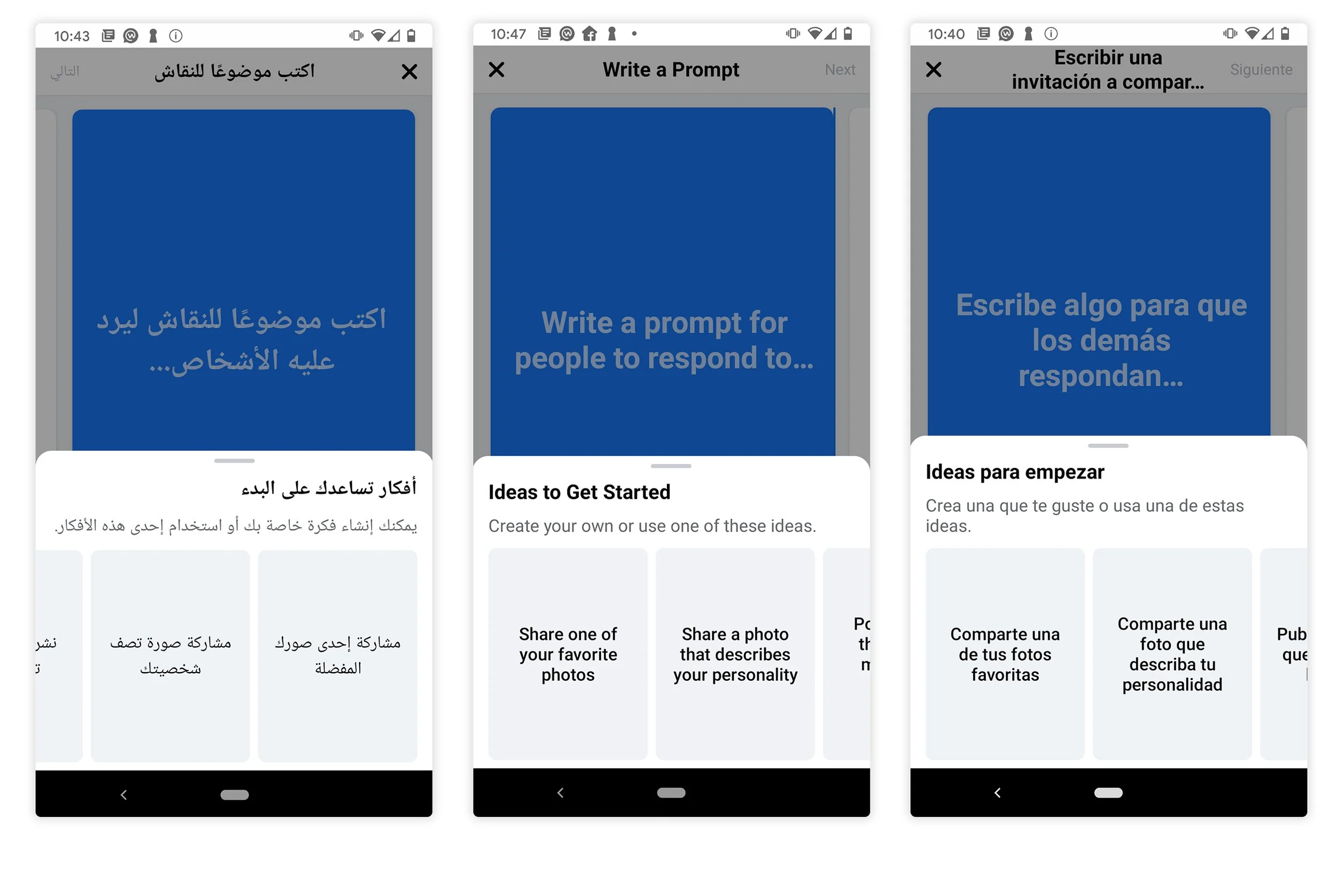
When I shared the final designs with the Facebook Design Systems (FDS) team, they initially recommended using older color pickers to match other parts of the app. However, those pickers were designed for a different product and didn't fit our specific needs.
To meet our launch deadline, we used the existing system for the MVP. However, I am still pushing for a more consistent experience. I’ve shared my research on the various color pickers used across Facebook with the FDS team, suggesting we work together to create a more unified UI for the future.
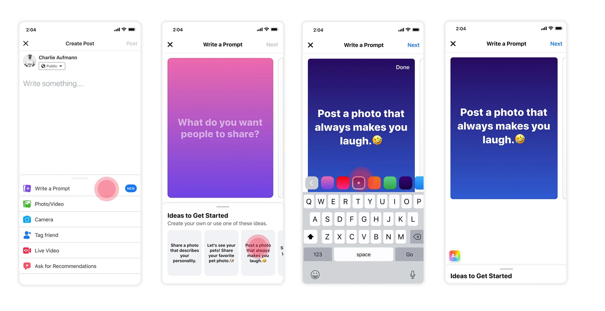
Final Design Direction
Web Design
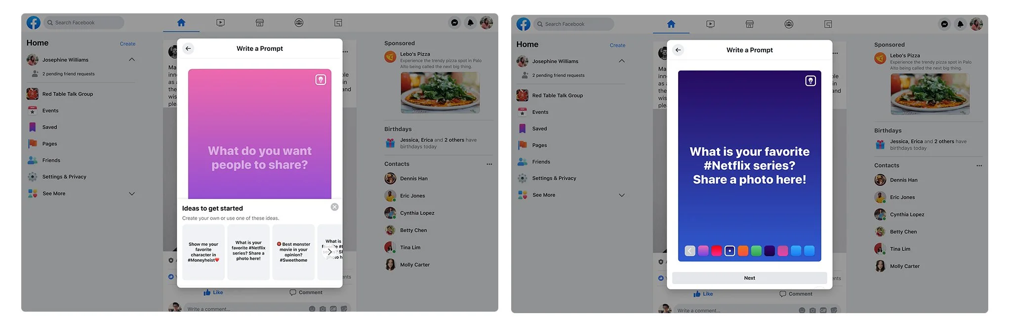
I also led the design for the web version. My goal was to keep the same smooth interaction from the mobile app while making sure it felt natural to use with a mouse and keyboard on a desktop.
Impact & Results
The results of the update were very positive, especially for our global communities:
Higher Engagement: We saw a 37% increase in total contributions across both English and non-English regions.
Better Quality: While the total volume of new posts remained stable, the compositional quality and relevance of those posts improved significantly, leading to more meaningful group discussions.
Clearer Intent: Before this update, many users were using the tool incorrectly (like creating personal photo albums). After the redesign, people used the prompts as intended—to start collaborative, group-wide conversations.